Leading a global wealth firm's major redesign
担当
I Led
Art Direction, Brand Identity, and Website Design
制作
I Made
Key Visuals, Infographics, Social Media Posts, UI & UX, Web Graphics, Iconography
チーム
With
And A Half Studio Team: Addi Panadero (CD), Petra Gana (Strategy), Jenny Lapus-Rala (PM)
クライアント
For
Leo Wealth Global
Leo Wealth Global
PROJECT OVERVIEW
プロジェクト概要
LEO Wealth is an independent wealth management firm that acts as a fiduciary for families across the US, Hong Kong, Singapore, and Japan, offering holistic advice on everything from investments to tax and estate planning.
In 2024, I designed their website along with the key visual, icons, data graphics, and presentation slides that shape how the firm looks today, and the site is still the one they use.

MARKET INSIGHTS & CHALLENGES
市場分析と課題
Before the redesign, LEO Wealth had almost no visual presence, and their old website was so plain that it said very little about who they were. In wealth management, that’s a real problem, because clients are deciding whether to trust someone with their family’s future.
My challenge was turning the main concept “an oath to your life’s wealth” into a visual language that felt precise and credible without becoming cold, so the firm could come across as both rigorous and genuinely personal.


WHAT I DID DIFFERENTLY
独自のアプローチ
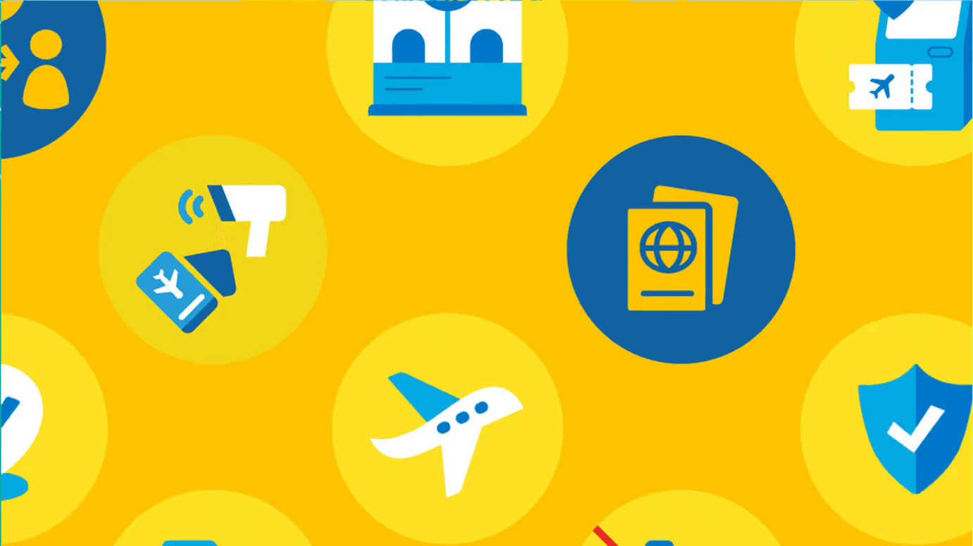
Working from the strategy developed by And A Half, I designed the full visual system and website, including the key visual, a custom icon set, data graphics, and presentation slides.
I worked closely with And A Half’s creative director, carrying the concept through every touchpoint so the brand feels consistent from the homepage to a client presentation. I carried the client's feedback across the website, icons, and decks, keeping every piece consistent.

RESULTS & IMPACT
成果と事業への影響
The new website launched in 2024 and is still LEO Wealth’s site today, giving the firm a presence that finally reflects the care it puts into its clients’ futures. The biggest change is how far it moved from where they started, from a site that said almost nothing to a visual identity that feels considered, trustworthy, and clearly their own.